
Reorder Blocks on Mobile | Squarespace 7.1
When you create a website in Squarespace it automatically creates a mobile version for you by stacking your blocks and sections on top of each other. However, depending on the way you have set up your website, you may find that you want the blocks in a different order on mobile.
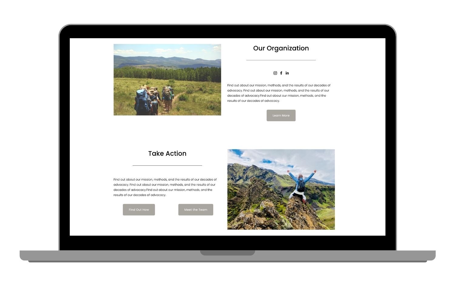
For example, a popular layout style is to have an image beside some content and then in another section below have the image on the other side. However, on mobile you then have image, content, content, image. This can make the mobile site a little confusing to follow.
In this video I show you how to change the order of the blocks on the mobile version of your Squarespace site.

The following code is used in the video.
/* Reorder Blocks on Mobile */
@media only screen and (max-width: 640px) {
  #COLLECTIONID #page .page-section:nth-of-type(1) {
    .row {
      display: flex;
      flex-direction: column-reverse;
    }
  }
}