
5 Strategies to Make Your Website More Mobile Friendly

In April of 2015, Google announced that they would be boosting the ranking of mobile-friendly pages when visitors searched on their mobile device. This means that if your website is not mobile friendly, your webpages will not rank high in any searches made by a mobile device.
The good news is that Squarespace already does a good job of making your website mobile friendly.
For example on the mobile version of your site, Squarespace automatically deletes out the spacer blocks and stacks the rest of the blocks on top of each other. However, there are some things you can do to make your website even more responsive.
Note: You can see the mobile version of your website by clicking on the mobile icon in the Squarespace Editor.
Strategy #1: Consider Your Page Size and Loading Times
You’re probably thinking…. “What? I thought you were going to show us how to make our site more visually appealing on mobile?”
Absolutely! But increasing your website’s mobile friendliness is more than just resizing images and text. If your website is taking forever to load on mobile, your visitors may jump ship before they even see your site. Newer model phones can handle a basic website as well as any computer. However, if they are relying on a cellular network for internet access, large websites may overwhelm them.
Use tools such as https://tools.pingdom.com/ to check your page speeds and sizes. Try not to be overwhelmed by the data. Focus on the following:
Page Size
Keep your website to less than 5MB. If your webpage is too large, scroll down to “Content size by content type” and see what content is the largest and work to make that content on your website smaller.
The most common issue is images. Make sure you compress all the images on your website before you upload them. Ideally, your image files should be smaller than 500KB.
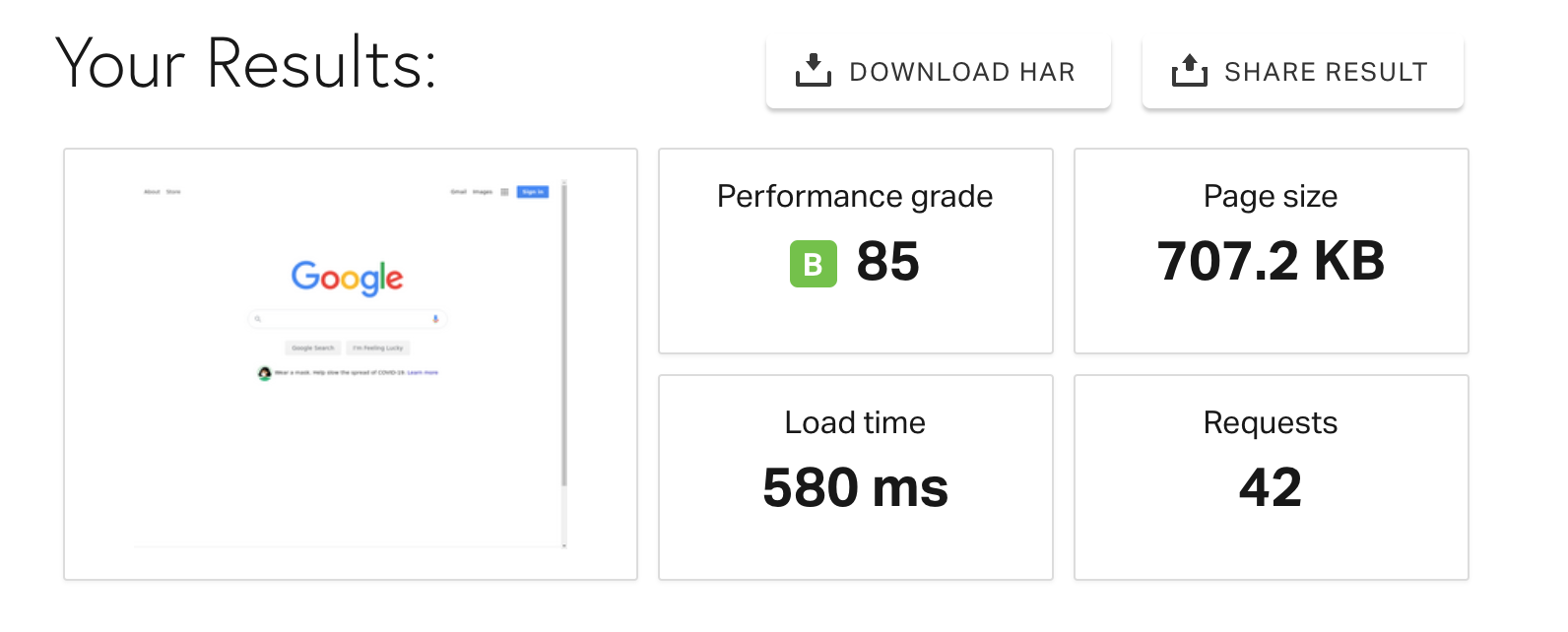

Load Time
Google recommends that your overall Load Time be 2 seconds or less for ecommerce websites. But don’t fret, not many websites are able to pull this off. In fact, the average load time of the top ranking websites in Google is between 3 to 6 seconds. If your load time is too slow, try decreasing the size of your content and minimize the number of places the website has to pull from. For example, if you have videos embedded on your site, be sure to use a custom thumbnail so that your website doesn’t have to pull the information from YouTube or Vimeo to load your page.
Check out https://www.bluecorona.com/blog/how-fast-should-website-be/ for more information on Load Time.
Bonus Tip: Enable AMP for Blog Pages to improve the loading speed. To find out more about AMP check out this guide by Squarespace.

Page Speed is also key for optimizing your site for search engines.
To learn more about SEO and how you can increase your chances of appearing on the first page of Google, Check out my SEO Course for Squarespace.
Strategy #2: Don’t Rely on Spacer Blocks for Side Padding
Spacer Blocks are one of my favourite Squarespace Blocks. Not only do they make it easier to create columns, they can help with creating a more minimalist layout by adding additional white space. However, if you find that you are using a ton of spacer blocks to add paddings to the side of your site you may be relying on Spacer Blocks too much. Remember that these spacer blocks are hidden on mobile for most templates which could change the mobile layout extensively.
Instead, adjust the padding of blocks and and the site margin in the Design Tab. In Squarespace 7.1, you can adjust the width of each section by clicking on Edit and then selecting the pencil icon.
Strategy #3: Add a Mobile Information Bar
If you have a business where your clients might visit your site for specific business details, it is a good idea to add an information bar to your mobile site that provides quick access to this information.
For example, if I go to the website of a Salon I may want quick access to their opening hours, location, and or a phone number to contact them. I may not want to click around their site to find this information. How convenient would it be, if there was a bar on the bottom of the site that showed this to me right away?!
To turn on the Mobile Information Bar you first need to go to Settings > Business Information and fill out your contact information, location, and business hours as applicable. Then go to Settings > Mobile Information Bar, enable the bar and choose the information you would like to be displayed.
Strategy #4: Make Your Text Mobile Friendly
Squarespace 7.1 uses "rem” instead of “px” as the unit for the text size. The benefit to this is that “rem” is responsive to screen sizes whereas “px” is not. Therefore, you most likely will not need to adjust the text size for mobile in Squarespace 7.1.
Squarespace 7.0 uses “px” however, so I usually add in media queries to adjust the text for multiple screen sizes. Check out my blog post How to Make Your Text More Mobile Friendly on Your Squarespace Website for more information.
Strategy #5: Make Your Images Mobile Friendly
Adjusting my images for mobile is something I do on every website I build. If the images are too large, they take up too much of the screen which will take away from the information you are trying to provide the visitor. To adjust your images for mobile check out the following blog posts
And there you have it!
Once you have completed these steps, it is a good idea to go to Google’s Mobile Friendly Test and test various pages. It will tell you whether that page is mobile friendly and suggest further strategies to improve any problems it detects.
It is also a good idea to sign up for Google Search Console which will regularly check your site and notify you should any future issues arise.