
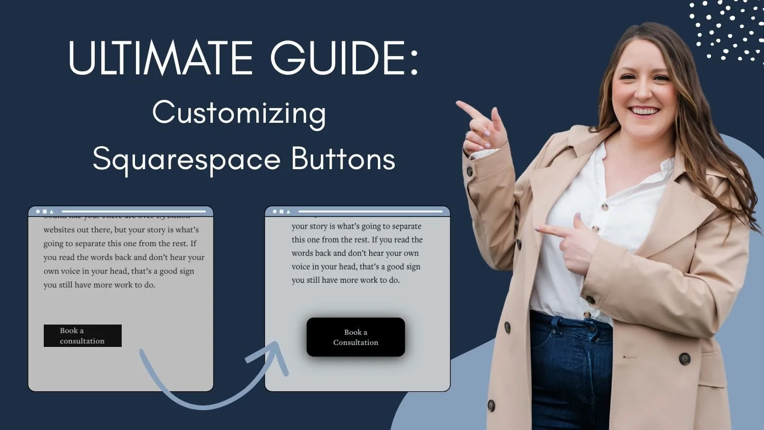
Ultimate Guide to Customizing Buttons in Squarespace
Buttons are one of the most powerful design elements on your Squarespace website—they guide clicks, drive conversions, and shape how polished your site feels. Yet most Squarespace users only scratch the surface of what button styling can do.
In this ultimate guide to customizing buttons in Squarespace, you’ll learn how to transform ordinary buttons into fully branded, high-converting design features with custom CSS. From changing background and text colors to adding outlines, rounded corners, shadows, gradients, image backgrounds, transparent styles, and even frosted glass effects, this tutorial walks you through every major button customization—including hover effects for interactive styling.
You’ll also discover exactly how to target different button types like primary, secondary, tertiary, header, mobile header, newsletter, form, add-to-cart, and member area buttons, plus how to apply styles globally, to certain sections based on color theme, to multiple button groups, specific pages, individual sections, or even one single button.
Whether you're a beginner experimenting with custom code or a designer looking for advanced control, this guide will give you everything you need to create beautifully customized Squarespace buttons that match your brand perfectly.
How to Set Up Your Basic Squarespace Styles
Before adding any custom code, it is important to use the provided Squarespace styles to their full potential. We never want to add code to our site if Squarespace can do it on its own.
Create a blank page on your site to use as a playground. Then add a block for each type of button you will have on your site. Go to the Site Styles and style the buttons using the Squarespace Site Styles. You can set the shape, outline, background fill, font size, and more in the Primary, Secondary, and Tertiary Button editor. Then go to the Color editor to edit the color themes.
Finally, in the page editor itself, you can now add transformations, animations, and layering to hide blocks on mobile view.
How to Target the Chosen Button (or Buttons)
Once you have done as much as you can with the provided Squarespace Styles, you can look into adding some custom CSS. The first thing you need to do is choose your selectors. Selectors tell the code what to target.
To start, copy and paste the following code into your custom css box.
SELECTOR {
background: red !important;  //background color
}
Next, choose the selector that matches the button (or buttons) you want to target and replace the word SELECTOR with the one you chose.
/* Primary Buttons */
.sqs-button-element--primary

/* Secondary Buttons */
.sqs-button-element--secondary

/* Tertiary Buttons */
.sqs-button-element--tertiary

/* All Button Blocks */
.sqs-block-button-element

/* All Primary Buttons Not Including the Header or Mobile Buttons */
.sqs-button-element--primary:not(.header-actions-action--cta *):not(.header-menu-cta *)

/* Header Button */
.header-actions-action--cta a

/* Mobile Header Button */
.header-menu-cta a

/* Newsletter Button */
.newsletter-block .newsletter-form-button

/* Form Button */
.form-block .form-submit-button

/* Add to Cart Button */
.sqs-add-to-cart-button

/* Member Area Button */
.sqs-block-member-area .join-button
Your code should now look something like the code below and you should see the button you want to target turn red.
/* Primary Buttons */
.sqs-button-element--primary {
background: red !important;  //background color
}
Important Note: If you chose to target the primary, secondary, or tertiary buttons, it will make these changes on multiple areas of your site. For example, header buttons, product buttons, forms and more all use the primary, secondary, or tertiary classes.
How do I target buttons based on the color theme?
When you use the selectors above, it will target those buttons regardless of the color theme. However, if you would like to target each color theme differently, you need to add one of the selectors below before the button selector.
Note: Make sure you have selected the color theme in each section. The section may look like it is following a color theme, but if you haven’t actually clicked on it, the selector won’t be in the code.
/* Lightest 1 Color Theme */
[data-section-theme="white"]

/* Lightest 2 Color Theme */
[data-section-theme="white-bold"]

/* Light 1 Color Theme */
[data-section-theme="light"]

/* Light 2 Color Theme */
[data-section-theme="light-bold"]

/* Bright 1 Color Theme */
[data-section-theme="bright-inverse"]

/* Bright 2 Color Theme */
[data-section-theme="bright"]

/* Dark 1 Color Theme */
[data-section-theme="dark"]

/* Dark 2 1 Color Theme */
[data-section-theme="dark-bold"]

/* Darkest 1 Color Theme */
[data-section-theme="black"]

/* Darkest 2 Color Theme */
[data-section-theme="black-bold"]
For example, if I wanted to target the primary buttons in sections using a Light 1 Color Theme, I would use the following code.
/* Primary Buttons in the Light 1 Color Theme */
[data-section-theme="white"] .sqs-button-element--primary {
background: red !important;  //background color
}
How do you target multiple types of buttons?
If you want to apply the same code to more than one type of button, you can use a comma between selectors. For example, if I wanted to apply some code to my Newsletter Button and my Form Buttons, my code would look like this (notice the comma between the two selectors!).
/* Newsletter Button and Form Buttom */
.newsletter-block .newsletter-form-button, .form-block .form-submit-button {
background: red !important;  //background color
}
How do you target buttons on one page or in a specific section?
To target only one page or one section, you need to add the Collection Id or Section Id to the front of the selector. I like to use the Chrome Extension “Squarespace ID Finder” to help me get these codes.
For example, if I wanted to target the primary button blocks on one page, my code would look like this.
/* Primary Buttons on the Home Page */
#collection-6888fca6ab7e040b00e0c83f .sqs-button-element--primary {
background: red !important;  //background color
}
If I wanted to target the primary button blocks in one section, my code would look like this.
/* Primary Buttons in Section Two of the Home Page */
section[data-section-id="6888fd3d365263832f4a7fbe"] .sqs-button-element--primary {
background: red !important;  //background color
}
How do I target one specific button?
Similar to targeting a single page or section, you need to add the Block ID to the front of the selector. For example, if I wanted to target a specific primary button block, my code would look like this.
/* Contact Button on the Home Page */
#block-yui_3_17_2_1_1753807988219_13035 .sqs-button-element--primary {
background: red !important;  //background color
}
Double Check Your Code
Before moving on to customizing the buttons, it is important to ensure that the code we have so far is correct!
Click around your website to various pages and make sure all the buttons you want to customize have a red background. Make sure there are no extra buttons targeted, as any buttons with the red background will change when we add your customization code.
How to Customize Your Squarespace Buttons
Now that we know you have targeted the correct buttons, we can customize them! There are endless options for you, but in this article, I will show you 9 different customizations. All you need to do is delete the code “background: red !important //background color” and replace it with the customization of your choosing. Then edit the values to match your brand and style.
Some of these customizations can be set with the built-in Squarespace Styles. Again, remember that you do not want to use code if Squarespace can do it on its own. However, you may want to apply these customizations on hover or on a specific page, section, or button, so I will still include them here.
Check below for instructions on how to have this code apply only on hover.
Background Color
background: red !important; //background color
Font Color
color: red !important; //font color
Add an Outline
outline: 2px solid red; //outline color
Round the Corners
border-radius: 50px !important; //round the corners
Add a Shadow
To add a shadow to buttons, go to a box shadow generator such as this one. Play with the sliders until you are happy with the shadow, and then copy and paste the code it provides.
Make the Background Transparent
background: rgba(0,0,0,0) !important; //transparent background
outline: 2px solid black;
color: black !important;
Use an Image as the Background
Prepare the image you would like to use. Make sure it is compressed so that it will not affect your page loading speed. Then upload it to the Custom Files on the Custom CSS page.
Copy and paste the following code. Delete the word IMAGEURL and place your cursor in between the brackets. Click on the image you uploaded into the custom files, and it will insert the image URL for that image into the code.
background: linear-gradient(transparent, transparent), url(IMAGEURL) repeat;
background-size: 100% 100% !important;
Add a Color Gradient
To add a color gradient to buttons, go to a gradient generator such as this one. Play with the options until you are happy with the gradient, and then copy and paste the code it provides.
Use a Frosted Glass Effect
background: rgba(255, 255, 255, 0.2) !important;
backdrop-filter: blur(10px);
-webkit-backdrop-filter: blur(10px);
border: 1px solid rgba(255, 255, 255, 0.3);
border-radius: 15px !important;
box-shadow: 0 4px 30px rgba(0, 0, 0, 0.1);
How to have the effect only apply on hover?
To have the effect apply on hover, you need to add “:hover” to the end of your selector. For example, if I wanted the primary buttons to have a red background on hover, I would use the following code.
/* Primary Buttons */
.sqs-button-element--primary:hover {
background: red !important;  //background color
}
If you are applying the code to more than one button type, you need to add “:hover” to all the selectors. For example, if I wanted my newsletter buttons and form buttons to have a red background on hover, I would use the following code.
/* Newsletter Button and Form Buttom */
.newsletter-block .newsletter-form-button:hover, .form-block .form-submit-button:hover {
background: red !important;  //background color
}
Bonus Tip: You can also add some code to have the effect transition into place instead of suddenly appearing. For example, I could have my primary buttons transition to a red background on hover with the following code.
/* Primary Buttons */
.sqs-button-element--primary:hover {
background: red !important;  //background color
transition: all 1s !important; //add a transition
}
So there you have it!
Customizing buttons in Squarespace is one of the simplest ways to make your website feel more polished, intentional, and uniquely yours. With the right CSS, you’re no longer limited to the default button styles built into the platform—you can create buttons that match your brand perfectly, improve user experience, and draw attention to the actions that matter most.
Whether you're adding effects to every button site-wide, targeting specific button types like header or add to cart buttons, or designing a one-of-a-kind call-to-action for a single page, these techniques give you complete creative control.
Start with one or two customizations, experiment with hover effects, and build from there—because even small button changes can make a big visual impact on your Squarespace site.
