
Portfolio Projects Side by Side on Mobile in Squarespace 7.1
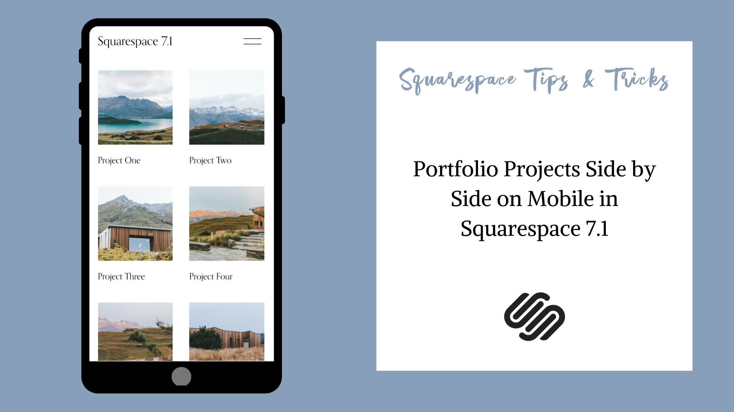
To help your Squarespace Website be responsive to different screen sizes, Squarespace has the projects in your portfolio pages automatically stack into one column on mobile.
However, if you have quite a few different projects you may not like this layout because it causes a lot of scrolling for your viewers.
In this video, I show you how to have your portfolio projects go side by side in two columns on mobile in Squarespace 7.1. All the code used in the video is provided below.
The following code is used in the video.
/* 2 Column Portfolio Grid */
@media only screen and (max-width:640px) {
.portfolio-grid-basic {
display: flex;
flex-wrap: wrap;
justify-content: space-between;
}
.portfolio-grid-basic .grid-item {
width: 45%;
}
}