
Make Your Video Banner Mobile Friendly in Squarespace 7.1
Video banners are a fun way to immediately grab your website visitors’ attention. With a background video or short animation, you can make a strong first impression that showcases your brand personality.
However, I often hear Squarespace designers complain about their video banners, because they don’t always work on mobile devices. There are generally two common problems:
The video won’t play on mobile devices.
Squarespace zooms in and crops the video for mobile devices, which can ruin the overall effect.
Because over 50% of web traffic comes through mobile devices, you can’t afford to let these issues slide.
Resizing the video usually is not the answer. This is because your video has a horizontal ratio. When you adjust the height, it will usually leave you with black space above and below the video, or it only fills up half the section—leaving the other half with a colored background.
But that doesn’t mean you should give up on videos! Today I’m going to talk about ways you can fix your video banner for mobile view.
How to Add a Video Banner to Squarespace
Squarespace video banner block
First, you will need to select a video for your Squarespace website. You can use a video you’ve filmed, or use a stock video from Canva.
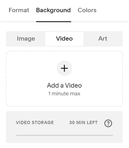
Adding a video banner to your Squarespace website is just like adding an image. Click the ‘Edit Section’ button for your website banner, then select ‘Background.’ Here, you can toggle back and forth between the background options: image, video, or art. (You can also just select a solid background.)
Your video banner can be a maximum of one minute long, but shorter is better. A long video will take more time to load, meaning your page might be blank for several seconds while the video is loading.
Even a short video will slow down your website speed. So you may want to add a custom loading screen to your website, to ensure your visitors aren’t looking at a blank page while the video is loading.

Ways to Optimize Your Banner Video
If you want your video banner to play on mobile as well as desktop, there are a few ways you can help optimize your video.
Compress the video to a smaller file size so it loads faster.
Choose a video that will still look good when zoomed in to display vertically on mobile.
Keep your video length as short as possible.
However, no matter what you do to optimize your video, I’ve found that it will not play on certain mobile devices.
This can be a big problem! If the video doesn’t play, Squarespace defaults to showing a plain color background for your website banner. And that’s probably not the first impression you want to make when visitors come to your website…
How to Add a Mobile Fallback Image
If your banner video won’t play, Squarespace provides an easy way for you to set an alternative option.
When you upload your video banner, you can also upload what Squarespace calls a ‘mobile fallback image.’ It’s an image that will replace your video on mobile devices, ensuring faster load times and proper formatting on mobile.
You can also create a mobile fallback image using a snippet of CSS. Just copy and paste the code snippet below into the Custom CSS box on your Squarespace website.
@media only screen and (max-width: 640px) {
#COLLECTIONID{
#page .page-section:nth-of-type(1) {
.sqs-video-background {
display: none;
}

.section-background {
background: url("IMAGEURL");
background-repeat: no-repeat;
background-size: auto 100%;
}
}
}
}
Once you paste the code into your website, you will need to replace “COLLECTIONID” with the actual ID for your page. If you aren’t sure how to find the ID, I show you how in the tutorial video.
Next, you will need to replace “IMAGEURL” with your selected mobile banner image. Under the CSS, click “Manage Custom Files” and upload your banner image. Then delete the placeholder “IMAGEURL,” click “Manage Custom Files” again, and select the image you just uploaded. Doing so will automatically insert the image link into your CSS.
Now you can toggle back and forth between your desktop and mobile view. You’ll notice that your banner video plays on desktop, while your banner image shows on mobile.
Note: I used an image that was 1000px wide and 1500px long for my mobile friendly image. If you would like to use an image banner instead of a video banner, click here to learn how to resize your image banner for mobile.